Your Xbox home screen is about to look much different
 Microsoft
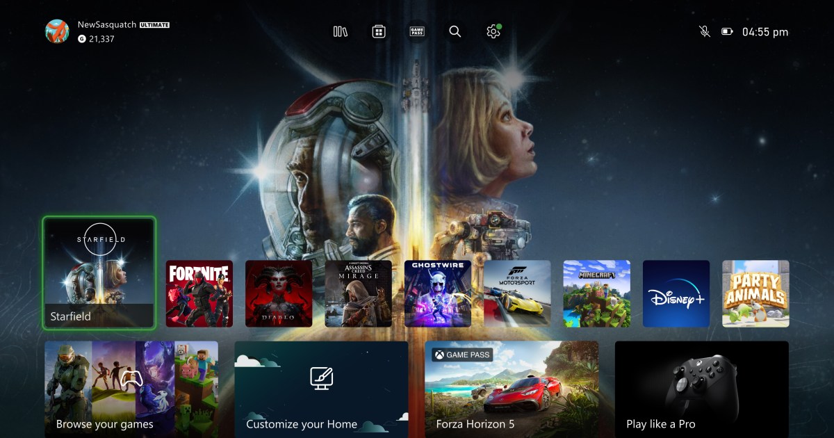
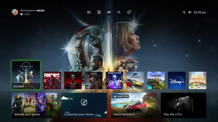
The Xbox home screen is getting a face-lift. Starting today, Microsoft will begin rolling out a freshly redesigned Xbox home interface across Xbox One, Series S, and Series X consoles.
If you’re an Xbox owner, you’re probably used to the consoles’ current design that features a row of recently used apps at the top of the screen and a list of widgets below. Microsoft says it looked at user data and feedback from the Xbox community to create a redesigned experience that’s more focused on discovery.
The biggest change is that Xboxes will now feature a quick access menu right at the top of the screen. This allows users to quickly access their apps, the Xbox store, Game Pass, and more.
The recently used apps row is still present, but with some major changes. It’s been moved down toward the bottom of the screen, leaving a space for a gap where users’ system theme displays more prominently. Hovering over certain apps will trigger a dynamic theme for certain games like Starfield and Forza Motorsport. It’s similar to how the PlayStation 5’s home interface functions, but with the themed background displaying above apps instead of below them.
 Microsoft
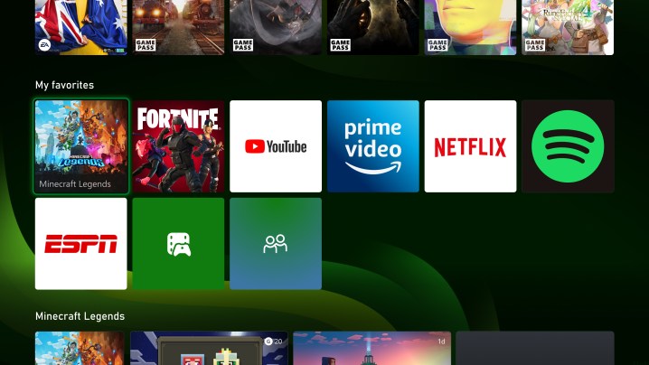
Underneath that, Xbox created a more discovery-based experience, complete with a personalized list of game recommendations, community updates, and a Watch & Listen module for new streaming app content. Users can further customize that part of the screen by pinning games and groups to the screen. It’s a sleeker redesign that should leave more room for personalization.
The new design will begin rolling out to select users today and will be available to all Xbox owners in the next few weeks.