Apple’s Home app redesign is just what HomeKit needs
One of the biggest announcements of WWDC 2022 is that the Apple Home app is getting a much-needed ground-up redesign.
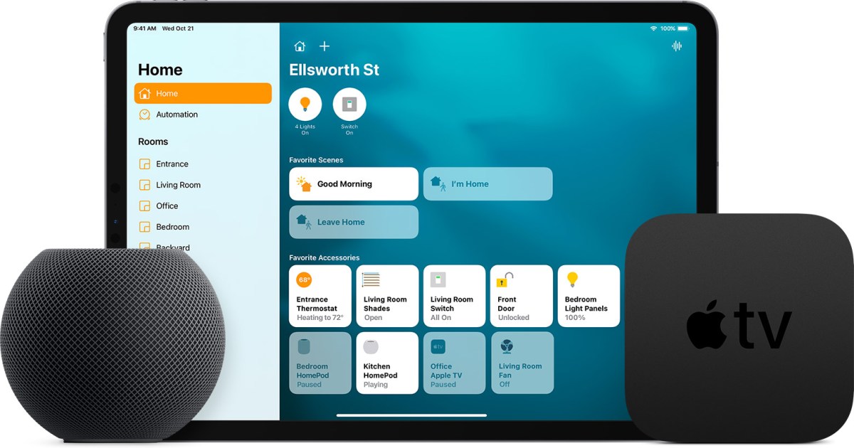
The new app changes how you navigate through the app and organize accessories, but the most important change is that you can now see your entire home from a single view. There’s no more jumping between menus to check things — you can view every connected device, including multiple camera views, from within a single page.
This is in contrast to the previous version of the app that contained tabs for Home, Rooms, Automation, and more. New categories break down your accessories between Climate, Lights, Security, and much more, and the multi-camera view makes it possible to live-view up to four cameras at once — with the option to scroll to see even more.
If you want to keep an eye on your home while you’re away, the ability to get a live view without tapping and waiting for a specific feed to load is a lifesaver. It makes the efficiency of the Home app that much better, especially if you’re used to using proprietary apps that take a long time to load.
Combined with the changes to the lock screen in iOS 16, this redesign makes HomeKit a far more appealing option than it was before. It does the one thing Apple has needed to do for a long time: Make HomeKit easier to use and more functional. Now all that’s needed is a more cohesive set of accessories that work with HomeKit.
On top of the overhaul of the Home app, Apple announced that Home is now part of Matter. This means that HomeKit should soon be able to work with a much wider range of devices than before.
Want to find out more about what was announced at WWDC 2022? Be sure to check out our continuing coverage.