Android 11 Hands-On Review: Full Of Features, Big And Small
After a number of delays, Google has launched the public beta of its latest mobile operating system, Android 11. The new operating system isn’t the most comprehensive update to Android ever — but it still brings with it some handy new features that will be useful to most people.
From updates to how Android handles notifications, to tweaks in the overall user interface, all the changes to Android 11 look promising. But how do they translate to real-world use? I’ve been testing a beta version of Android 11 on a Pixel 4 since it was released.
Note that Android 11 is only just entering public beta. There are bugs in the operating system, and it’s likely that more features will be added before a full consumer launch in the fall. Despite all that, I have a good idea of what to expect from the final version.
(More) notification changes
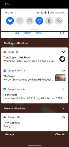 The biggest change to Android 11 is the way your phone handles notifications. That’s right, Google is completely changing Android’s notification system again. But that’s not a bad thing, as Google’s tweaks to notifications make Android notifications better than how they’re handled on iOS.
In Android 11, notifications are grouped into more intuitive and easy to manage groups. Notably, messages from all your favorite messaging platforms are now split out into their own sections at the top.
Not only that, but the operating system goes a step further in helping you manage conversations. You can mark those conversations as priority, and they’ll have their own dedicated section on the lock screen.
Notifications are split into three sections — conversations, alerting notifications, and silent notifications. The conversations section, as mentioned, splits up conversations from any supported chat app, including Android Messages, Facebook Messenger, WhatsApp, and so on.
Messaging is a little easier in Android 11, as you can now have chat bubbles for supported apps. You don’t have to open an app every time you want to reply to a message. It’s basically the same as Facebook Messenger’s Chat bubbles system, but while it has been done before, it’s nice that a range of other apps will be able to do something similar. It helps make messaging on Android feel a little more coherent for those that use multiple apps.
You can tweak the priority of chat notifications, too. If you long-press a conversation, you can choose between Priority, Alerting, and Silent. Alerting works exactly like other notifications, and Silent will prevent the thread from alerting you — though you’ll still see notifications in the conversations section. Priority shows notifications in the status bar and on the lock screen, and those notifications will be highlighted with coloring around them.
Media playback controls in the notification shade have moved, too. They’re now in the quick settings panel. They let you not only control your media and its volume, but also select an output — so if you’re wearing a pair of headphones, but want to play something out of the phone’s speakers, you can quickly and easily do so.
A new power menu
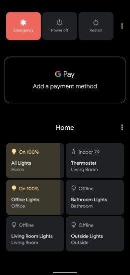 The power button in Android 11 is no longer just for turning your device on or off. You’ll now get a host of extra controls in the power menu for accessing tap-to-pay, your smart home, and more.
Press down on the power button for a second, and the power menu appears. At the top, you’ll get an emergency alert button, a power button, and a restart button. Directly under that, you can see and control your payment methods for Google Pay.
Under that, there are controls for favorite Google Home-enabled devices. You’ll also be able to add and edit the controls you see on the power menu. You can hold down on those controls for a second to get additional access, like dimming for smart bulbs, temperature control for thermostats, and so on.
It’s nice to see Google giving users more control over smart home devices. Slowly but surely, the company seems to have realized that while voice controls are great, not everyone wants to use them all the time — or at all. Apple has long allowed for quick and easy smart home control in the Control Center, and the addition of home controls in the power menu is a great answer to that.
Home screen and multitasking
 The home screen in Android 11 remains nearly untouched, except for the fact that you can now replace your dock with a row of Google-suggested apps, which Google recommends based on artificial intelligence.
I enabled the feature and generally found that Google was good at recommending apps — but there were certain times when I had to dig into the app drawer to find apps that otherwise would have been in the dock.
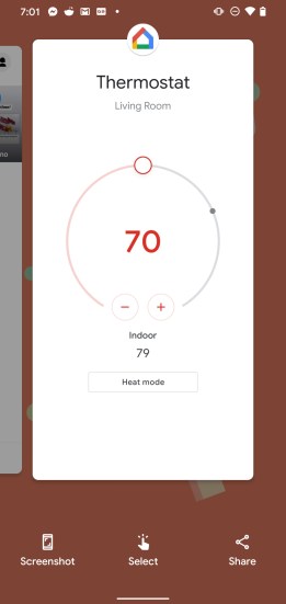
A few new controls have been added to the multitasking screen. When you enter multitasking, you’ll notice three new controls under the apps on the display. The first is a screenshot button that allows you to take a quick screenshot of the selected app. Next is a “select” button that uses artificial intelligence to highlight text that you might want to quickly copy. Last but not least is a share button.
The screenshot feature is pretty handy, but it’s hard to imagine using the other controls a lot.
Permissions
Google has once again tweaked permissions in Android 11, but not as much as in previous versions of Android. Perhaps the biggest change is that you can now “reset” the permissions of an app you haven’t used in a while, after which you’ll be asked again for permissions that the app wants to request.
Google has also added Apple’s “one-time permission” feature, which allows you to grant specific permission to an app once, and once only. This is definitely a welcome addition.
Conclusions
Android 11 generally seems to offer a number of great improvements over Android 10. Honestly, there aren’t any tweaks that I didn’t like. There are tweaks that I’m not sure many people will use, but the new version of Android has a number of improvements that will seriously enhance the overall experience.
Of course, it’s important to note that it’s currently unclear how companies like Samsung will handle these tweaks. While using a beta version of Android on a Google Pixel phone means that what you see is pretty much what you’ll get, other companies change the overall user interface of Android, and that may make for a different experience.
Android 11 will likely be released to consumers sometime in August or September.
